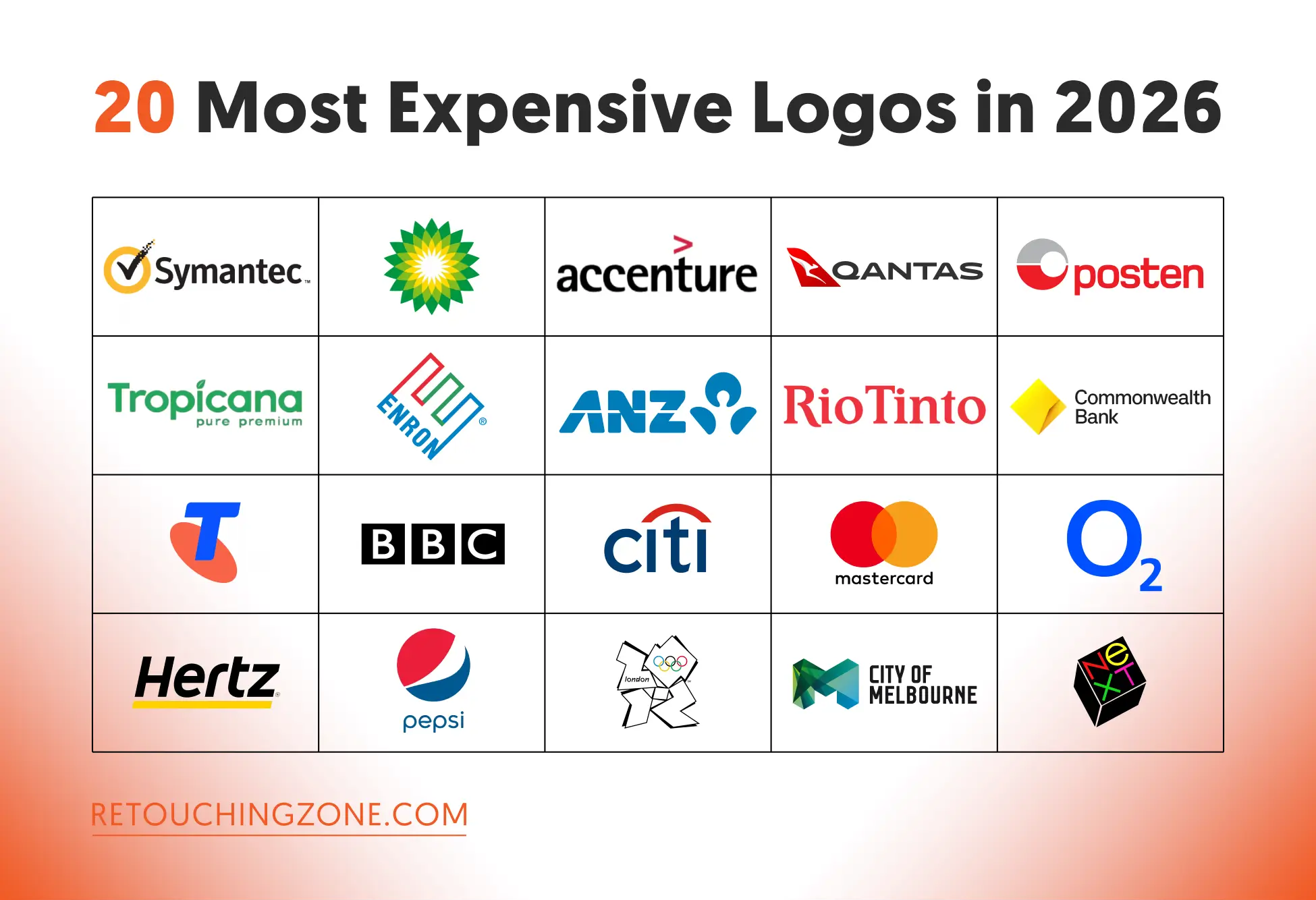
You’ll understand that graphic design is the lifeblood of rebranding when you take a look at the most expensive logos in the world till 2026. At the very top of the rank, you will find Symantec, British Petroleum, Accenture, followed by world-renowned companies like Quantas, Posten Norge, Tropicana, and Enron.
The countries represented by the brands across the chart are the USA, UK, Australia, Ireland, and Norway.
The eye-popping costs you’re about to see aren’t just for designing logos, but rather for taking a comprehensive approach to shaping them.
Let’s break down the richest logos around the world and assess the weight of relabeling among different types of service providers.
Table: 20 Most Expensive Logos in the World (Up to 2026)
| Brand Logo | Logo Design Approximate Cost (USD) | Year | What They Do | Country |
| Symantec (VeriSign Acquired) | $1.28 billion | 2010 | Cybersecurity | USA |
| British Petroleum (Helios Rebranded) | $211 million | 2000 | Oil, gas, energy products & services | UK |
| Accenture (Rebranded) | $100 million | 2001 | Management consulting, IT services | Ireland |
| Qantas | $70 million | 2016 | Airlines | Australia |
| Posten Norge (Rebranded) | $55 million | 2008 | Postal, logistics, courier services | Norway |
| Tropicana | $35 million | 2009 | Fruit juice beverages | USA |
| Australia & New Zealand (ANZ) Bank | $15 million | 2009 | Banking | Australia |
| Rio Tinto | $2.5 million | 2020 | Mining, metals, natural resources | UK |
| Commonwealth Bank | $2.5 million | 2012 | Banking | Australia |
| Telstra | $2 million | 2011 | Telecommunications | Australia |
| BBC (Redesigned) | $1.8 million | 1997 | Broadcasting media | UK |
| Citibank | $1.5 million | 1998 | Banking | USA |
| Mastercard | $1.5 million | 2016 | Payment card services | USA |
| O2 | $1.5 million | 2002 | Telecom | UK |
| Hertz | $1.5 million | 2013 | Car rental | USA |
| Pepsi (Redesign) | $1 million | 2008 | Soft drinks manufacturer | USA |
| London 2012 Olympics | $625,000 | 2007 | Multi-sport event | UK |
| Melbourne | $240,000 | 2009 | City branding | Australia |
| Belfast | $180,000 | 2008 | City branding | USA |
| NeXT | $100,000 | 1986 | Computer hardware & software | USA |
Symantec (VeriSign Acquired) | ~ US$1.28 billion
 – When Rebranding Hits a Billion Dollars")
First of all, Symantec didn’t pay a design agency this much. To get the “checkmark” logo, the recognized symbol of online security at the time, they had to go through an acquisition with VeriSign. This merging allowed them to build on decades of consumer trust.
British Petroleum (Helios Rebranded) | ~ US$211 million
 – When Rebranding Hits a Billion Dollars")
The surprising BP logo design cost is the story behind the company’s transformation from a “petroleum” company to an environmentally conscious “energy” company. The massive marketing campaign, paired with the “Helios” logo, has seen the company update its signage at over 28,000 pumps, uniforms, and gas stations worldwide.
Accenture (Rebranded) | ~ US$100 million
 – When Rebranding Hits a Billion Dollars")
After the legal separation from Andersen Consulting, the Accenture logo design was completely redesigned in 147 days. The new name, “Andersen”, was designed to retain market share, including the Accenture logo cost.
Quantas | ~ US$70 million
 – When Rebranding Hits a Billion Dollars")
Relabeling has increased costs across everything from logos to uniforms and aircraft. A refreshed brand has been prioritized to maintain the airline’s global reputation at the time. And this rollout is behind the massive spending to implement a global operational footprint.
Posten Norge (Rebranded) | ~ US$55 million
 – When Rebranding Hits a Billion Dollars")
The Posten Norge rebrand strategy included formal letters to the company’s associated e-commerce and logistics firms. Plus, it spent a budget on a uniform update at every mail carrier, post office, and delivery truck level scattered throughout Norway.
Tropicana | ~ US$35 million
 – When Rebranding Hits a Billion Dollars")
This cost, attached to redesigning and packaging, is one of the brightest examples where the outcome was bad. Instead of the image of an orange fruit, here came a glass filled with juice. The logo was, of course, flipped vertically as it was enlarged.
Many consumers did not recognize the new logo, and this feeling ended in disgust. Here you can see that sometimes rebranding does always come with good things, and you gotta stick to the traditional approach.
Australia & New Zealand (ANZ) Bank | ~ US$15 million
 – When Rebranding Hits a Billion Dollars")
The need for a symbol (“Lotus”) that would work across cultures in Australia and New Zealand, as well as Asian countries, has been a budget-busting endeavor. They opted for centralizing multiple branches across several countries. This significant move has saved them from higher marketing costs in the long run.
Rio Tinto | ~ US$2.5 million
 – When Rebranding Hits a Billion Dollars")
This is the most expensive logo ever sold in recent decades that introduced a unique visual language for Rio Tinto. It coordinated the mining company’s decentralized global mining operations.
Thanks to this costing, ESG (environmental, social, and governance) values were reinforced with governments and investors.
Commonwealth Bank | ~ US$2.5 million
 – When Rebranding Hits a Billion Dollars")
The Australian international bank gave its black-and-yellow diamond logo a sharper look in 2012. The subtle redesign involved the wordmark and rounding off the corners. The cost covered the coordination of the logo design with a full digital and print rollout for the bank’s millions of customers.
Telstra | ~ US$2 million
 – When Rebranding Hits a Billion Dollars")
The “telco” identity led the vibrant, digital evolution of the second decade of the 21st century. A flexible multi-colour palette, combined with a complete redesign of SIM packaging, billing statements, and retail store interiors, modified the finance in gross level.
BBC (Redesigned) | ~ US$1.8 million
 – When Rebranding Hits a Billion Dollars")
This was the most expensive logo in the history of the UK until BP’s Helios rebranding. System standardisation: The huge cost was driven by the need to introduce a single replacement for hundreds of different sub-logos (channel, radio, etc.) on a uniform grid system.
The redesign of the logo was also intended to make it readable on low-resolution digital screens and TV watermarks from the 1990s.
Citibank | ~ US$1.5 million
 – When Rebranding Hits a Billion Dollars")
The huge expenditure was incurred as a result of the brand merger between Citicorp and Travelers Group. The single, unified name later came to be “City”.
Another issue that worked in the casting was the legal protection gained by having the common red arc in the logo. This made global trademarking very easy.
Mastercard | ~ US$1.5 million
 – When Rebranding Hits a Billion Dollars")
It wasn’t really an innovation; it was a refinement by the then-renowned design agency Pentagram. The new, lowercase wordmarks worked great on a mobile app icon. Plus, the stadium banners also got a comprehensive visual system that complemented the costing.
O2 | ~ US$1.5 million
 – When Rebranding Hits a Billion Dollars")
You might be surprised to learn that the world-renowned UK mobile operator BT Cellnet adopted the name “O2” in 2001. The high cost of the rebranding wasn’t just a logo change; it also covered the rollout of offices worldwide, which numbered 178.
Lambie-Nairn was behind the minimal logo design, which aimed to create a complete language to underpin everything stakeholders want to do, not only packaging and advertising.
Hertz | ~ US$1.5 million
 – When Rebranding Hits a Billion Dollars")
Hiring Lippincott to design the logo in 2013 was not a wrong decision for Hertz at all. The cost wasn’t just the design; it covered rolling out the rebranding with-
- Concierge service
- Virtual kiosks
- Recharging
- Road Trip by Hertz
- Retail stations
- FedEx drop points
- iPad stations
The redesign also included vehicle and telematics-based bus tracking via a mobile app.
Pepsi (Redesign) | ~ US$1 million
 – When Rebranding Hits a Billion Dollars")
The core of the 2008-2009 redesign activities was to replace the old logo with a new one wherever it appeared. The Arnell Group was responsible for redesigning Pepsi. The cost of adding point-of-sale equipment, trucks, vending machines, and stadium signage around the world amounted to hundreds of millions of dollars.
London 2012 Olympics | ~ US$625,000
 – When Rebranding Hits a Billion Dollars")
This jagged, abstract symbol is one of the most controversial logos in Olympic history. While the skyrocketing cost of the design and campaign paid for its global visibility, it was met with considerable ridicule upon release. Unlike any previous Olympic logo, it was made to be energetic and youthful.
City of Melbourne | ~ US$240,000
 – When Rebranding Hits a Billion Dollars")
Branding related to public affairs is often complex, and Melbourne is no exception. The cost of this included stakeholder engagement, extensive research, and the creation of a flexible identity system. This was reflected in everything from business cards to public transport.
City of Belfast | ~ US$180,000
 – When Rebranding Hits a Billion Dollars")
Like Melbourne’s logo, this logo was also aimed at being vibrant and forward-looking. The city’s rebranding budget included extensive consultation with community groups, the city council, local businesses, and almost all public sectors.
NeXT | ~ US$100,000
 – When Rebranding Hits a Billion Dollars")
Rebranding of this tech company, founded by Steve Jobs, included the development of a visual identity with an iconic logo, a brand manual, and typography styling. The entire design was done by Paul Rand, a renowned graphic designer at the time.
Steve Jobs’ plan was to make his investment credible and distinctive in the technology market in the 1990s.
Frequently Asked Questions about the Most Expensive Logos Ever
What is the most expensive logo in the World till 2026?
US cybersecurity company Symantec (VeriSign-acquired) continues to keep its position as the most expensive logo to date in 2026. Took place in 2010, the cost of this rebranding was estimated at US$1.28 billion.
Which brands have the richest logos in the UK?
The UK’s richest rebranded companies so far are:
- BBC: US$1.8 million (redesigned 1997)
- Rio Tinto: US$2.5 million (2020)
- O2: US$1.5 million (2002)
- London 2012 Olympics: US$625,000 (2007)
What are the most expensive logos ever made in the banking sector?
The three companies with the highest redesign costs in the banking sector so far are:
- Australian Bank Australia & New Zealand (ANZ): US$15 million (2009)
- Australian Commonwealth Bank: US$2.5 million (2012)
- American bank Citibank: US$1.5 million (1998)
Why is the Symantec logo so expensive?
The cost of creating a new logo was largely due to VeriSign’s acquisition of Symantec. This was coupled with the fee for the “checkmark” logo for online security. These two factors had a major impact on the company’s overall rebranding, making the visual identity included in the most expensive logos of all time.
How much was the Accenture logo price?
Irish management consulting and IT company Accenture has a global presence thanks to technological advancements. The company spent US$100 million on a new logo design during its 2001 rebranding.
In a Nutshell
These 20 most expensive logos in the world till 2026 identify the milestones of the top companies with rebranding so far. Among them, US IT company Symantec (VeriSign Acquired) is at the top of the list, hitting the billion mark, with no other company close behind.
British Petroleum leads the way in the million-dollar category, with Pepsi at the bottom. Sitting at the front sit below the million mark is London 2012 Olympics.
The sectors that have been mentioned more than once in terms of company function are:
Banking sector: ANZ Bank, Citibank, and Commonwealth Bank
Telecom sector: Telstra and O2
City: Melbourne and Belfast
The most recently rebranded company is Rio Tinto (2020), while the one with a redesign from the distant past is NeXT (1986).